

Designing a Mobile-First Canvassing Experience
Improving field data collection workflows for real-world canvassing environments.
Overview
Grassroots Unwired is a platform used by canvassing teams to collect data, manage outreach efforts, and track engagement in the field.
This project focuses on redesigning the canvassing experience with a mobile-first approach, improving usability and efficiency for users operating in fast-paced, real-world environments.
Problem
Canvassing workflows require users to move quickly through tasks while engaging in live, in-person interactions. However, existing interfaces can introduce friction through unclear navigation, dense layouts, and inefficient data entry patterns.
- Slower interactions during conversations
- Increased likelihood of input errors
- Difficulty navigating between tasks in real time
Users
- Canvassers — mobile users conducting outreach in fast-paced environments
- Campaign Managers — users who rely on accurate, structured data collected from canvassing efforts
Constraints
- Mobile-first usage in dynamic, real-world environments
- Time-sensitive interactions requiring speed and clarity
- High-volume data entry during conversations
- Need for clear structure across complex workflows
Design Approach
- Streamlined navigation to reduce cognitive load
- Improved hierarchy to highlight primary actions and information
- Designed for quick, one-handed mobile interaction
- Reduced friction in data entry and task completion
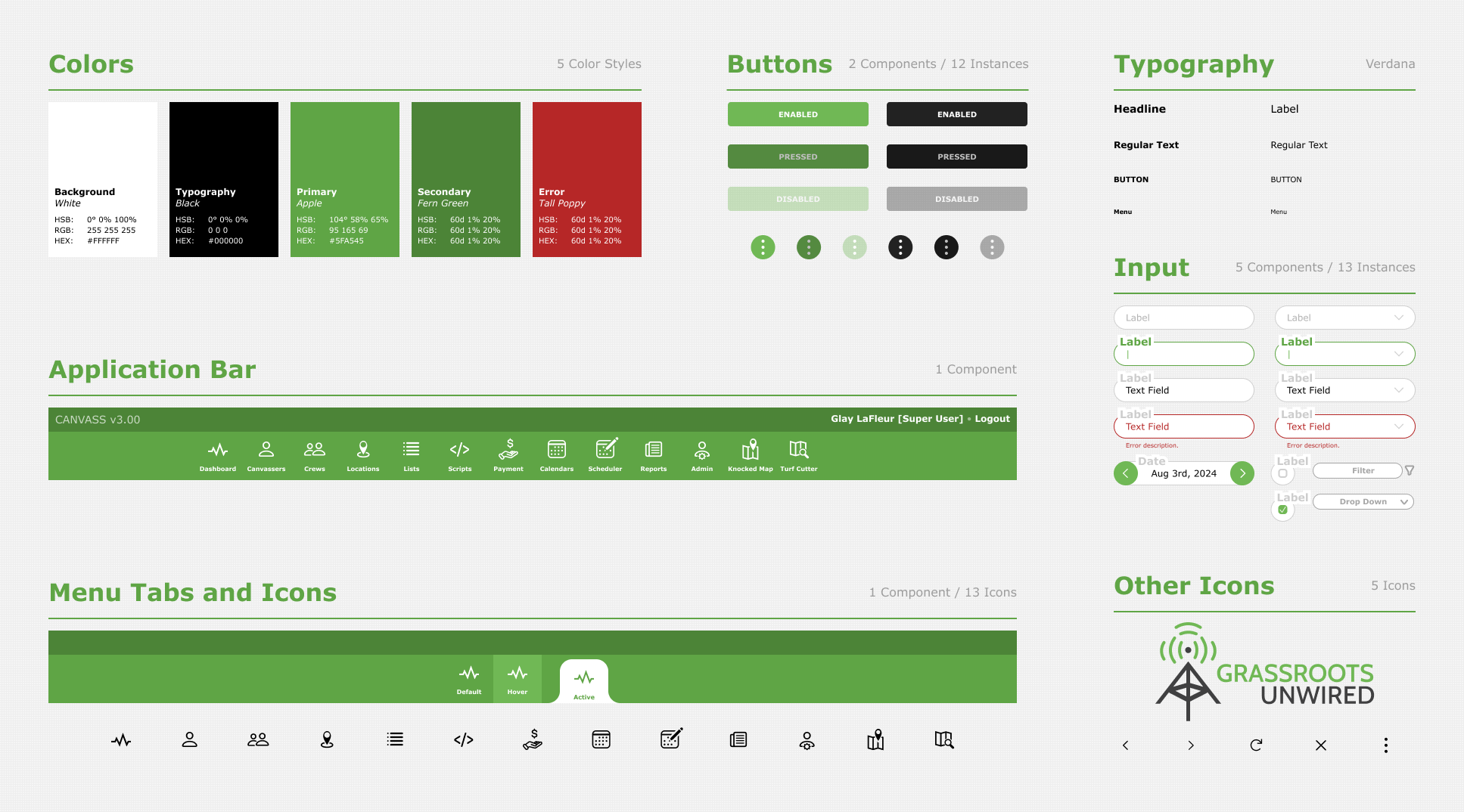
Visual System
A consistent visual system was established to improve clarity, hierarchy, and usability across the interface. This included defining typography, color usage, and component styles to support a cohesive and scalable design.
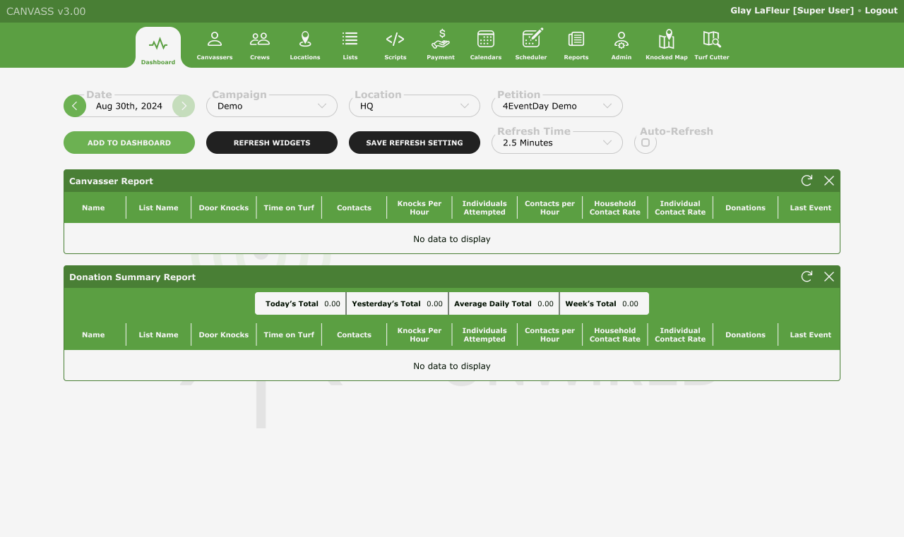
Redesigned Dashboard
The dashboard was redesigned to prioritize the most important information and actions, making it easier for users to quickly understand their tasks and navigate the application.
- Clearer hierarchy of content
- Reduced visual clutter
- More accessible primary actions
- Improved readability for mobile use
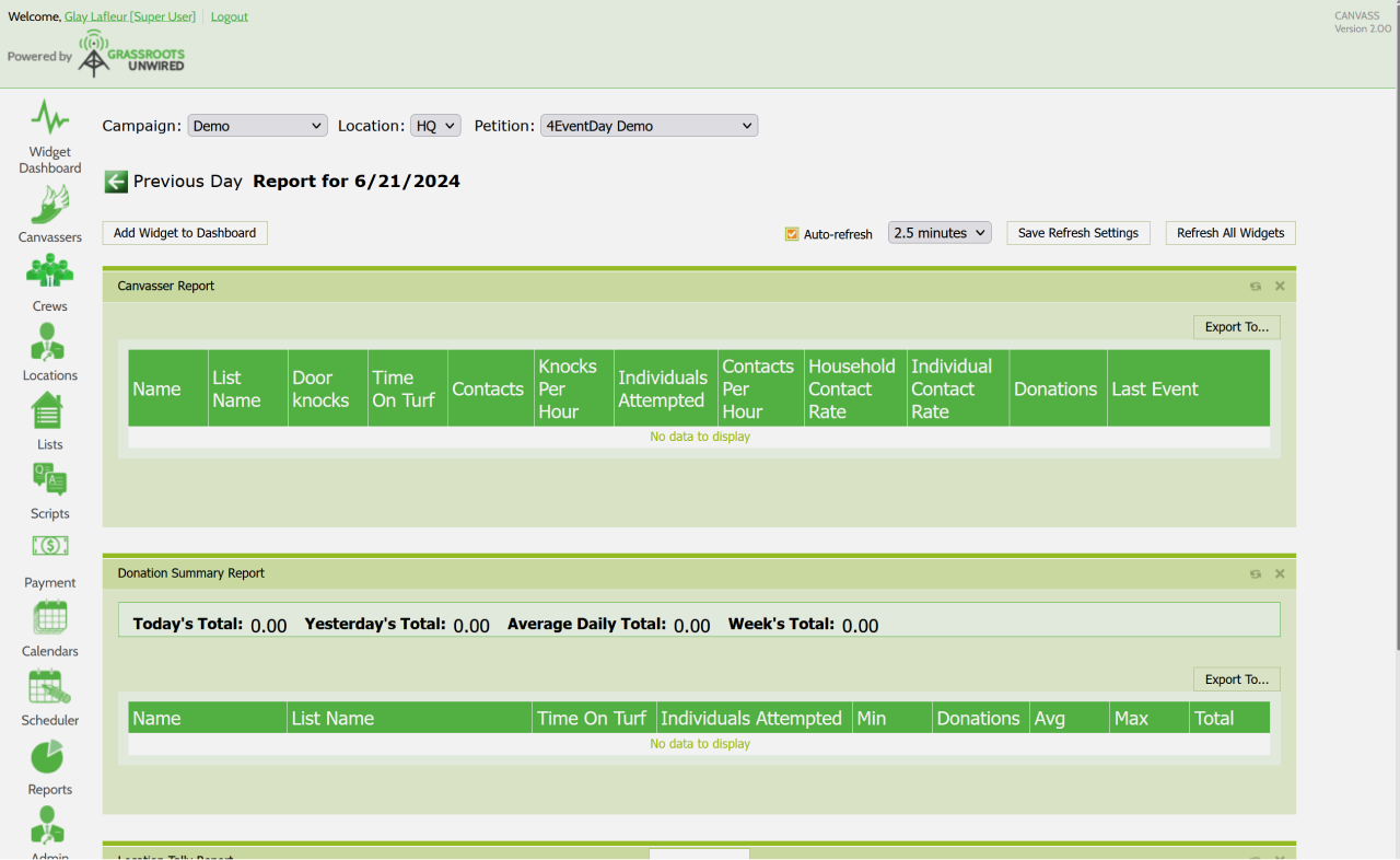
Before vs After
The original dashboard presented information in a way that made it harder to quickly identify key actions and navigate efficiently.
The redesigned version simplifies the layout and improves usability by emphasizing structure, clarity, and ease of interaction.
Outcome
- Reduced friction during live interactions
- Faster navigation and data entry
- Improved clarity in high-pressure environments
- More scalable and consistent interface design
Reflection
This project emphasized the importance of designing for real-world conditions rather than ideal scenarios.
Designing for mobile, time-sensitive environments requires careful attention to clarity, hierarchy, and interaction efficiency. In future iterations, incorporating direct user feedback and usability testing would further refine and validate these improvements.